I evaluated a mental-health mobile app using multiple research methods rather
than relying on one source of evidence. The study combined interaction mapping, five user interviews,
personas, competitive analysis, Nielsen heuristic evaluation, and usability testing with five first-time
users.
5 min read · Click-through presentations
RoleUX Research & Design Consultant (graduate project)
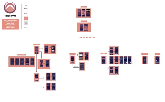
↗Original HappierMe interaction map documenting the product’s navigation and screens.
01 / Context
About HappierMe
HappierMe, developed by Human Wisdom, is a mental-wellness and personal-development app. The experience
studied in 2024 brought together topic-based learning, daily practices, journaling, a discussion forum,
coaching, and events. Its breadth created several possible ways to get help, but it also made navigation
an important part of the product experience.
Our graduate research asked how first-time users understood that experience. Could they find a relevant
starting point, move between activities, and complete the actions that the client considered important?
The goal was to identify concrete usability barriers and turn the findings into recommendations the
product team could use.
My role and contribution
I contributed as a UX researcher and designer within a University of Michigan graduate team. The
broader evaluation included interaction mapping, user interviews, personas, competitive analysis,
Nielsen heuristic evaluation, and first-time-user usability testing.
For the usability study, I moderated one of the five participant sessions and contributed to the
team’s analysis and recommendations. My later HappierMe internship built on this product
familiarity, but it was a separate phase of work. I distinguish the graduate evaluation from the
subsequent feature and marketing work throughout this case study.
02 / The problem
What needed to change
An app that supports reflection should help people understand what to do next. Our testing revealed
moments where participants had to work out the interface before they could reach the activity they
wanted. Opening prompts, topic selection, search, and menu contents did not always match their
expectations.
The design challenge was to make the product’s existing value easier to reach. We focused on clearer
starting points, more predictable navigation, and shorter routes through the core activities rather than
proposing additional content as the first solution.
First-time users
The intended study population was ages 17–44; all participants were new to HappierMe.
Returning users
People using daily practice and journaling needed repeatable paths back to familiar activities.
Product stakeholders
The client needed findings tied to specific screens, task failures, and actionable
recommendations.
03 / Approach
How I approached the work
01
Build a picture of the whole experience
Interaction mapping documented how the product’s screens and navigation connected. Interviews,
persona work, competitor review, and heuristic evaluation provided complementary perspectives on
user needs and interface conventions.
Using several methods helped us compare what the interface appeared to support with what people
actually understood when they used it. The interaction map remains useful evidence of the app’s
breadth and the number of routes a new user had to interpret.
02
Test realistic tasks with first-time users
The team recruited five people with no prior HappierMe experience and piloted the test before the
final sessions. After the pilot, task wording was made more direct. Tasks covered daily
practice, changing a topic pathway, contacting a coach, writing a journal entry, posting to the
forum, and finding an event.
Sessions used Zoom recording and phone screen sharing. A moderator guided each participant while
the team logged observations and tracked time. I moderated one session. Debrief questions
explored participants’ impressions, navigation difficulties, and whether they could imagine
returning to the app.
03
Look for repeated mismatches between expectation and behavior
Four of five participants were confused by the initial “continue where you left off” and “select
a new topic” choices. They preferred a recognizable Home screen as an anchor. All five opened
the hamburger menu expecting navigation or settings, but encountered content such as events and
testimonials.
All five also expected the search bar to search the full app, including events and the happiness
survey. Its narrower topic search did not match that expectation. These repeated patterns made
navigation and search priorities for the recommendations.
04
Connect task friction to specific changes
Participants noticed larger actions more easily than smaller pathways such as Events. One of five
attempted to register for an event that had already passed. On the forum, all five completed a
post without selecting a topic; two of five described guided journaling as lengthy.
We recommended a default Home screen, clearer topic labels, app-wide search, more prominent
important actions, a better-organized menu, explicit forum topic selection, and fewer journaling
prompts. Preserving journal responses would also make it easier to return to an unfinished
reflection.
05
Recognize what the study could and could not establish
The app changed while the study was underway, so some participants encountered features the team
had not seen when designing the tasks. Long pages also exposed a gap in our moderation plan: we
had not established a consistent point for intervening when someone became stuck.
Recruitment deadlines limited demographic variety. These five sessions provided useful usability
evidence, but the proportions below describe this small sample, not the entire HappierMe
audience. A broader follow-up study would be needed to test the recommendations across age
groups and measure changes after implementation.
04 / From evidence to
decisions
What shaped the direction
Each recommendation was tied to an observed interaction. The counts describe the five-person usability
study.
Project observations, responses, and intended benefits
What mattered
The response
Why it mattered
4 of 5 participants were unclear about the opening
choices.
Open on a recognizable Home screen with clear topic labels.
Give people an understandable starting point.
5 of 5 expected search to find content across the
app.
Expand search beyond topic modules.
Match a familiar behavior instead of requiring a new search
model.
5 of 5 expected navigation or settings in the
hamburger menu.
Reorganize menu content and move preferences into the profile
area.
Make the structure more predictable.
2 of 5 found guided journaling too long.
Reduce prompts and preserve entered responses.
Reduce effort and make unfinished reflections easier to resume.
5 of 5 posted to the forum without choosing a topic.
Make topic selection explicit before submission.
Improve categorization without preventing expression.
05 / The work
Explore the original work
Read the original research findings and click through the full summer internship presentation. The two
viewers keep the research phase and later implementation work distinct.
Usability research findings · 5 pages
The original analysis and recommendations, with the participant appendix omitted from this public
portfolio.
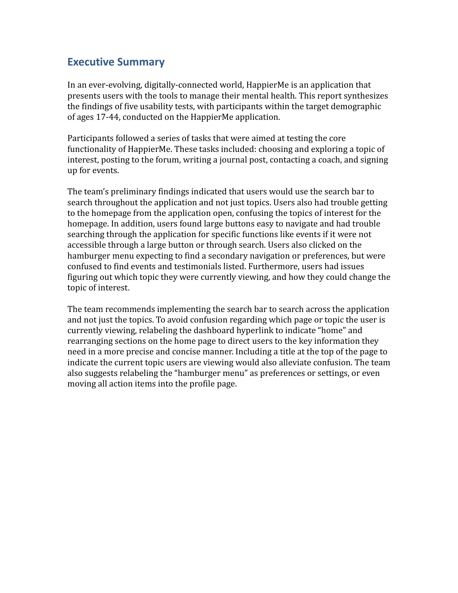
Executive Summary
In an ever-evolving, digitally-connected world, HappierMe is an application that
presents users with the tools to manage their mental health. This report synthesizes
the findings of five usability tests, with participants within the target demographic
of ages 17-44, conducted on the HappierMe application.
Participants followed a series of tasks that were aimed at testing the core
functionality of HappierMe. These tasks included: choosing and exploring a topic of
interest, posting to the forum, writing a journal post, contacting a coach, and signing
up for events.
The team’s preliminary findings indicated that users would use the search bar to
search throughout the application and not just topics. Users also had trouble getting
to the homepage from the application open, confusing the topics of interest for the
homepage. In addition, users found large buttons easy to navigate and had trouble
searching through the application for specific functions like events if it were not
accessible through a large button or through search. Users also clicked on the
hamburger menu expecting to find a secondary navigation or preferences, but were
confused to find events and testimonials listed. Furthermore, users had issues
figuring out which topic they were currently viewing, and how they could change the
topic of interest.
The team recommends implementing the search bar to search across the application
and not just the topics. To avoid confusion regarding which page or topic the user is
currently viewing, relabeling the dashboard hyperlink to indicate “home” and
rearranging sections on the home page to direct users to the key information they
need in a more precise and concise manner. Including a title at the top of the page to
indicate the current topic users are viewing would also alleviate confusion. The team
also suggests relabeling the “hamburger menu” as preferences or settings, or even
moving all action items into the profile page.
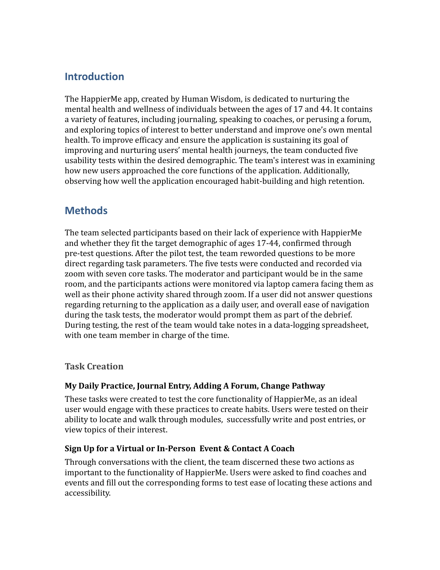
Introduction
The HappierMe app, created by Human Wisdom, is dedicated to nurturing the
mental health and wellness of individuals between the ages of 17 and 44. It contains
a variety of features, including journaling, speaking to coaches, or perusing a forum,
and exploring topics of interest to better understand and improve one’s own mental
health. To improve efficacy and ensure the application is sustaining its goal of
improving and nurturing users’ mental health journeys, the team conducted five
usability tests within the desired demographic. The team's interest was in examining
how new users approached the core functions of the application. Additionally,
observing how well the application encouraged habit-building and high retention.
Methods
The team selected participants based on their lack of experience with HappierMe
and whether they fit the target demographic of ages 17-44, confirmed through
pre-test questions. After the pilot test, the team reworded questions to be more
direct regarding task parameters. The five tests were conducted and recorded via
zoom with seven core tasks. The moderator and participant would be in the same
room, and the participants actions were monitored via laptop camera facing them as
well as their phone activity shared through zoom. If a user did not answer questions
regarding returning to the application as a daily user, and overall ease of navigation
during the task tests, the moderator would prompt them as part of the debrief.
During testing, the rest of the team would take notes in a data-logging spreadsheet,
with one team member in charge of the time.
Task Creation
My Daily Practice, Journal Entry, Adding A Forum, Change Pathway
These tasks were created to test the core functionality of HappierMe, as an ideal
user would engage with these practices to create habits. Users were tested on their
ability to locate and walk through modules, successfully write and post entries, or
view topics of their interest.
Sign Up for a Virtual or In-Person Event & Contact A Coach
Through conversations with the client, the team discerned these two actions as
important to the functionality of HappierMe. Users were asked to find coaches and
events and fill out the corresponding forms to test ease of locating these actions and
accessibility.
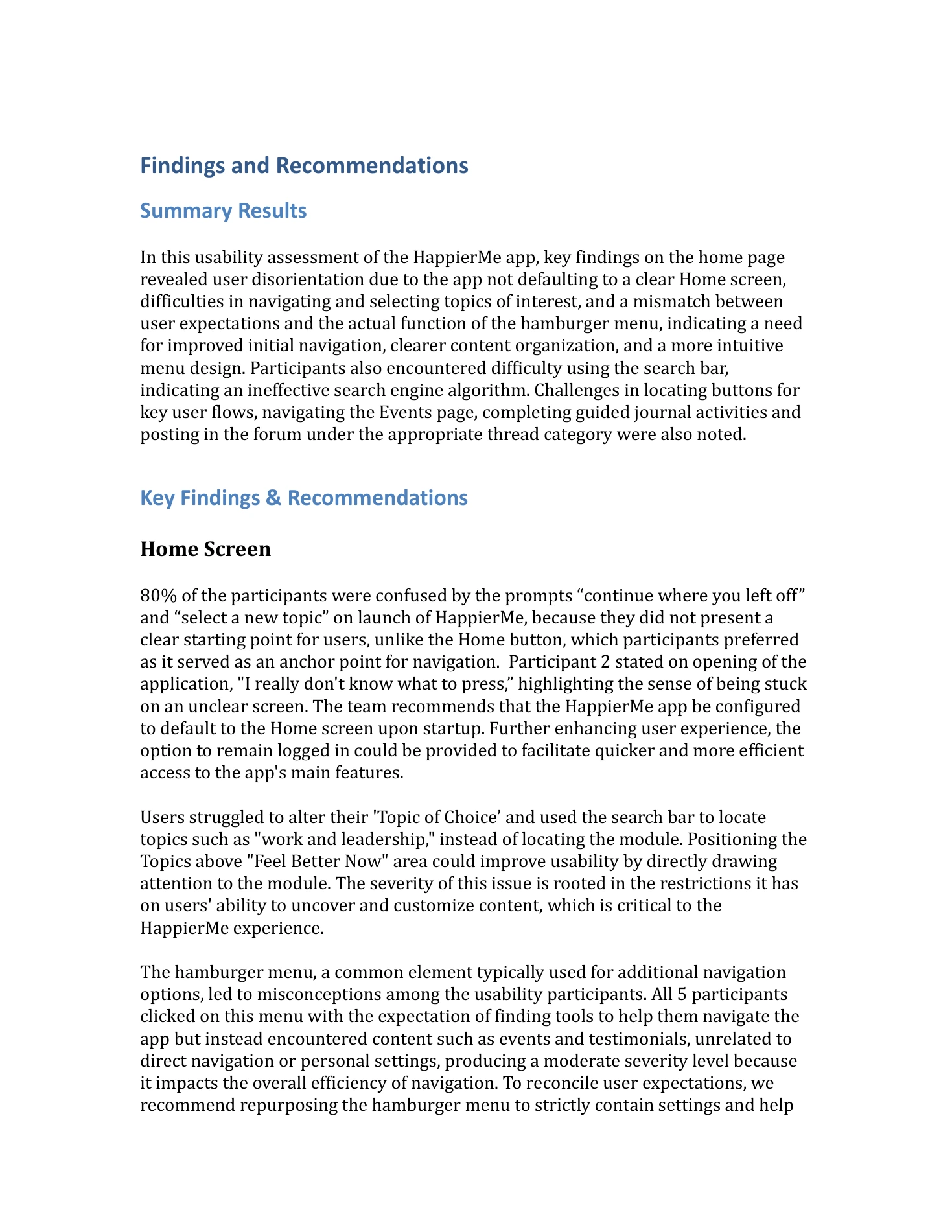
↗Navigation findings and recommendationsRead slide text
Findings and Recommendations
Summary Results
In this usability assessment of the HappierMe app, key findings on the home page
revealed user disorientation due to the app not defaulting to a clear Home screen,
difficulties in navigating and selecting topics of interest, and a mismatch between
user expectations and the actual function of the hamburger menu, indicating a need
for improved initial navigation, clearer content organization, and a more intuitive
menu design. Participants also encountered difficulty using the search bar,
indicating an ineffective search engine algorithm. Challenges in locating buttons for
key user flows, navigating the Events page, completing guided journal activities and
posting in the forum under the appropriate thread category were also noted.
Key Findings & Recommendations
Home Screen
80% of the participants were confused by the prompts “continue where you left off”
and “select a new topic” on launch of HappierMe, because they did not present a
clear starting point for users, unlike the Home button, which participants preferred
as it served as an anchor point for navigation. Participant 2 stated on opening of the
application, "I really don't know what to press,” highlighting the sense of being stuck
on an unclear screen. The team recommends that the HappierMe app be configured
to default to the Home screen upon startup. Further enhancing user experience, the
option to remain logged in could be provided to facilitate quicker and more efficient
access to the app's main features.
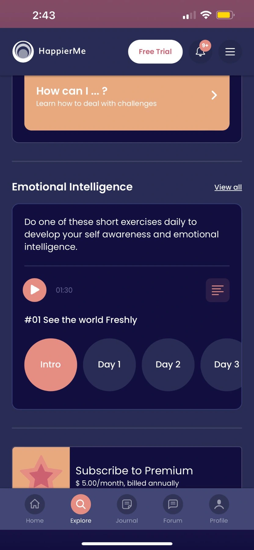
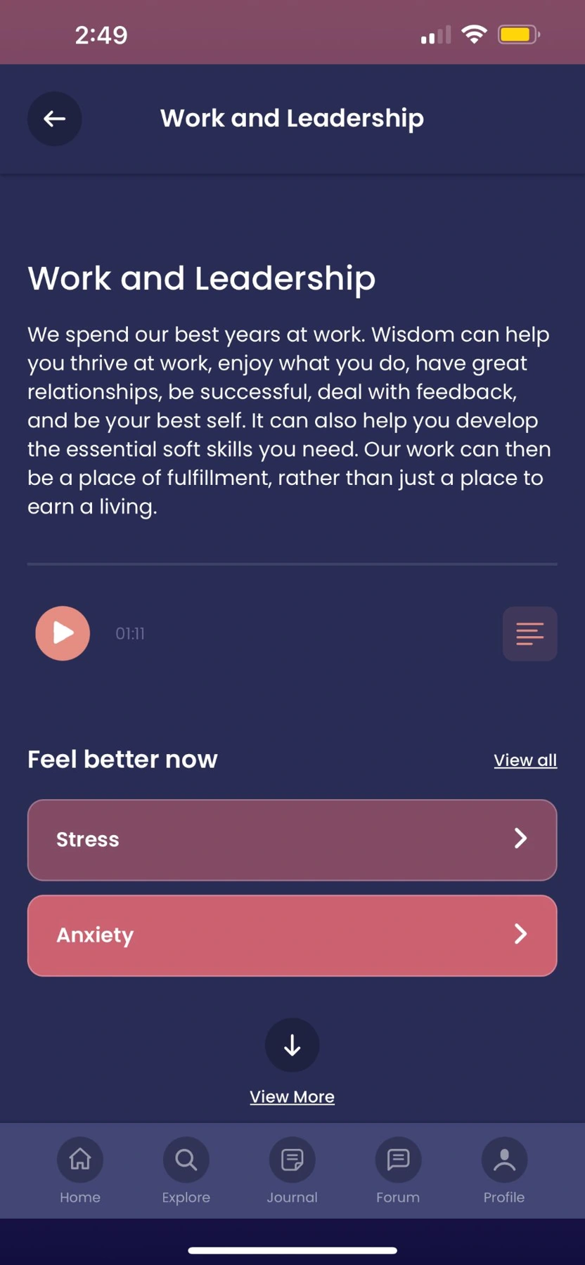
Users struggled to alter their 'Topic of Choice’ and used the search bar to locate
topics such as "work and leadership," instead of locating the module. Positioning the
Topics above "Feel Better Now" area could improve usability by directly drawing
attention to the module. The severity of this issue is rooted in the restrictions it has
on users' ability to uncover and customize content, which is critical to the
HappierMe experience.
The hamburger menu, a common element typically used for additional navigation
options, led to misconceptions among the usability participants. All 5 participants
clicked on this menu with the expectation of finding tools to help them navigate the
app but instead encountered content such as events and testimonials, unrelated to
direct navigation or personal settings, producing a moderate severity level because
it impacts the overall efficiency of navigation. To reconcile user expectations, we
recommend repurposing the hamburger menu to strictly contain settings and help
↗Search, events, forum, and journaling findingsRead slide text
options within the user's profile to further streamline
navigation.
Search Bar
All five participants attempted to utilize the search bar to find events and the
happiness survey. However, the search bar did not function as expected, as users
expected to be able to search the app entirely and not just topics. This discrepancy
hindered users' ability to find the desired content efficiently. Addressing this issue
is
critical for HappierMe’s success, as highlighted by one of our participants who
remarked, “usually when I don't know anything, I always go to the search bar." To
address this issue we recommend the search function to search across the apps and
not just within topics.
Explore Page
Participants encountered challenges in locating certain modules and buttons on the
explore page, such as the “Events” button, primarily due to their small size. Larger
buttons, such as "Find a Coach," were found to be more easily recognizable.
Additionally, the “Events” page displays both past and upcoming events and one user
out of five selected an event that had already passed, inadvertently attempting to
register for it. While the discrepancy between larger and smaller buttons stands out
as a critical issue, challenges with the “Events” page are comparatively less severe.
Our recommendation is to increase the size of buttons for key user user pathways
such as “Events” which will improve users’ ability to navigate and engage with the
application.
Forum & Journal
On the Forum page, it was noted that none of the five participants clicked the
dropdown and selected a topic when creating a new post. However, since all five
participants successfully completed the task, this usability issue is deemed to be of
low severity. Additionally, 2 out of 5 participants said the guided journal activity was
lengthy. Participants expressed frustration over the number of steps involved in the
process and expressed a desire to quit the process prematurely, signaling a
moderate usability challenge that warrants further attention.
To address the Forum issue, the team suggests making topic selection mandatory
and implementing an alert when they attempt to submit the forum post without a
topic selected. Regarding the Journal feature, the team’s recommendation is to
decrease the number of prompts in the guided journal process to a number
comparable to the Apple Journal, which is performing well amongst Apple users.
Allowing users to retain their responses when revisiting guided questions would
enhance the user engagement as well. By implementing these recommendations, the
↗Limitations and research conclusionsRead slide text
application can better meet the needs of its user base and
enhance the overall
usability.
Discussion
Throughout the usability testing process, the team encountered several
challenges, which affected some results. One significant challenge revolved around
rapid iterations within the application. The continuous updates caused participants
to engage with new features, which moderators had not observed while structuring
tasks. This problem led to another challenge which was the team not having an
established point of intervention. Since the application contained long pages of
content, participants tended to spend extended amounts of time finding the task to
complete, making it difficult for the team to identify an appropriate time to redirect
participants onto the right path, thereby preventing extended time on a single task.
The final limitation during this session was most participants were in the same age
range. Due to a tight recruiting and testing deadline, the team was unable to find
participants with a diverse demographic. For future tests, it is essential to discuss
recruiting methods to ensure that everyone from the target audience is being
represented, which will lead to obtaining more diverse insights.
Conclusion
The usability assessments for HappierMe enabled the team to identify several
key insights such as unintuitive navigation, unclear direction for topic selection,
disorientation on the home page, and lengthy modules to complete. Based on the
insights, the team provided recommendations to address these challenges which
will enhance the usability and customer satisfaction, such as reconfiguring the
hamburger menu into settings and ensuring clear navigation. Further steps include
delivering the recommendations to the client and explaining the insights from the
usability tests categorizing them by severity level.
1 / 5
1 / 9
A closer look at the visuals
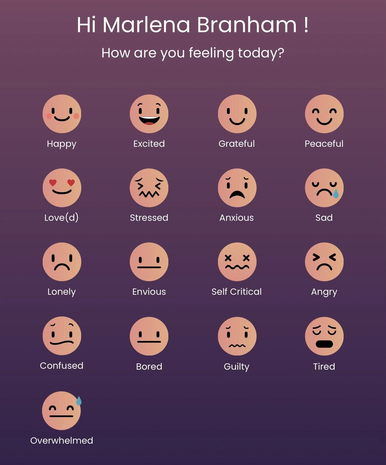
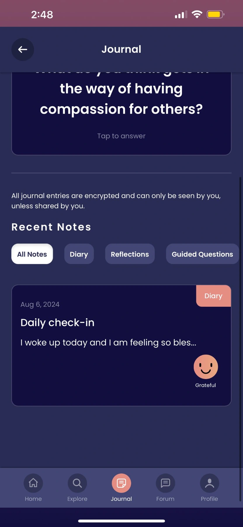
↗Mood check-in interface.↗Guided journal interface.↗HappierMe home and content discovery.↗Work and leadership content pathway.
The graduate project delivered an interaction map, research synthesis, usability findings, and
prioritized recommendations covering onboarding, navigation, search, events, forum behavior, and
journaling. The outcome was a specific improvement agenda for the client rather than a generalized
request to make the app easier to use.
During the later summer internship, I conducted and analyzed additional usability work that contributed
to Daily Check-In and Wellness Score improvements, as documented in my internship
presentation. Those subsequent product contributions are shown in a separate slide viewer below. The
original graduate study did not measure a post-release increase in retention or conversion.
07 / Reflection
What I would carry forward
The clearest lesson was that interface conventions are part of a user’s starting knowledge. When a search
bar or menu behaves differently from what people expect, the product asks them to relearn something
before they can benefit from the content.
On a future study, I would agree on intervention rules earlier, record the product version used in each
session, and recruit a wider age range. Those changes would make comparisons more consistent and help
distinguish a stable usability issue from a feature that changed during testing.